Monday 14 March 2011

Task 2


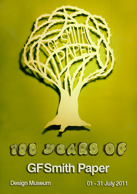
I'm really pleased with how my poster turned out. I feel it portrays a vintage feel, suitable for marking 100 years as well as having a modern twist, letting the viewer know it's a current poster.

The 100 years is shown through the 100 rings in the tree stumps in the hand drawn typography. I wanted to use trees as a theme as that's ultimately where paper comes from. I was inspired by Rob Ryan's paper cut outs, and as I'm a long time fan of stencil art decided to try my hand at the intricate cutting involved. I'll be honest. I absolutely love the technique and it's definitely something I will be doing again. It was important for me to hand cut the paper, rather than using a laser cutter as I was hoping to show the natural side of the product. So it only seemed right to cut the paper by hand, not machine.
Task 1, signed and sealed

Well, we're all up to date on task 1 now. Everything I've mentioned on here has been expanded on in my sketchbook. 


Now then, let's take a look at task 2.

Task 1 Final Piece

I wanted to photograph this piece as though underwater. I therefore shot it against a black background  with numerous lights at various angles creating a scattered light effect. 


I'm genuinely pleased with this this outcome as I feel my research shines through and helped me develop a unique and interesting structure.

Wednesday 9 March 2011

The Prototype

As a result of my research I set about developing a deep sea inspired paper structure. The result was the following piece:


Pleased with this I decided to move this forward to produce my final piece for task 1.

Saturday 5 March 2011

Repetitive and interesting buildings


The next step was researching buildings that I felt had forms or lines that could be well represented in paper and architecture showcased repeat.

The Getty Centre


Really nice strong and clean lines. The curves are so strong yet smooth, and almost look as if they are made out of paper already. I can't help but imagine a paper structure made by repeating strong curves made by scoring the paper.


Greene House

Designed by Herb Greene (1961) It's hard not to imagine this as a paper sculpture. (or maybe I've just been thinking about paper too much..) To my eye it's an exciting structure that could be recreated using repeating pleats and layering of strips of paper.


Sydney Opera House


Really smooth and clean lines. One of the most recognizable buildings in the world. I can just imagine this the exoskeleton of a crustacean. The underwater theme seems to continue with the rest of the buildings I've picked out in this blog.


Neue Staatsgalerie

The glass front on this building reminds me of a pleated wave. (such as those featured in Richard Sweeney's work.


Rooftop Office


Again, this building has a crustacean feel to it. I know it's a crude similarity, but it reminds me of a lobster draped over a house.

I think it's obvious that my next avenue for research should be crustaceans and other sea creatures.

Friday 4 March 2011

Let me bring you up to speed.

OK, I'll be honest. I've not updated my blog for a while. So in the next few posts I'll bring you up to speed.

So where to start? Research of course! Well my starting point was simply to scour Sheffield City Center with my camera, searching for anything with a repeat in it. It quickly became apparent that architecture was not only flowing over with repeat forms and patterns, but that it linked incredibly well to the structural aspect of the paper forms we've been learning about in the work shops.

Below are some of the photographs from this day:


The rest of the photos from this day can be seen in my sketchbook.

I've realised that repeat shapes, forms and patterns are all around us. It's just about discovering new ways to look at things. With my focusnow on architecture I set out to find some influential buildings to use as inspiration...